


Designed and shipped a live AI companion app from zero, solo. From product strategy and UX design to Google Play in weeks, using AI-assisted development.
Aevi is a live AI companion app on Google Play, designed for daily emotional check-ins, private journaling, and weekly insights. I built it entirely solo, owning every layer from product strategy and UX design through to React Native development and deployment.
The idea came from a gap I kept noticing: people wanted a private, low-pressure space to process their day. Existing apps were either too clinical (mood trackers with graphs) or too unpredictable (general AI chatbots with no emotional context).
Aevi sits in the middle. A companion that remembers, reflects, and responds, without trying to be a therapist or a generic chatbot.
Most AI products in 2026 fall into one of two failure modes. Mood tracking apps collect data but feel clinical and detached. General AI chatbots respond to anything but remember nothing and carry no emotional continuity. Neither felt like a companion. The design challenge was to build something that sits between them: an AI that feels consistent, present, and personal without pretending to be a therapist or a friend.
Hand-drawn before any pixels. Mapping the chat screen, content creation, and the long-press interaction.


Memory surfacing, not memory recall. Aevi does not list what it remembers. Instead it surfaces relevant context naturally inside responses, the way a person would. This required designing the AI prompt architecture to inject prior context without making the interaction feel like a database lookup.
Onboarding as invitation, not setup. Most apps start with permissions and preferences. Aevi starts with a single question: what brings you here today. No toggles, no feature tour. The goal was to make the first interaction feel like the start of a conversation, not a form.
Weekly insights as reflection, not reporting. The weekly insight is not a stats dashboard. It is a short, written reflection on patterns from the week, generated by the AI but written in a warm, human tone. The design decision was to make it feel like something worth reading, not something to dismiss.
Tone consistency over feature density. Every screen decision was filtered through one question: does this feel calm and considered? The colour system, typography scale, spacing, and interaction patterns were all chosen to maintain a consistent emotional register across every state.

The onboarding flow was designed to establish trust before asking for anything. Each step has a single purpose and a single action.
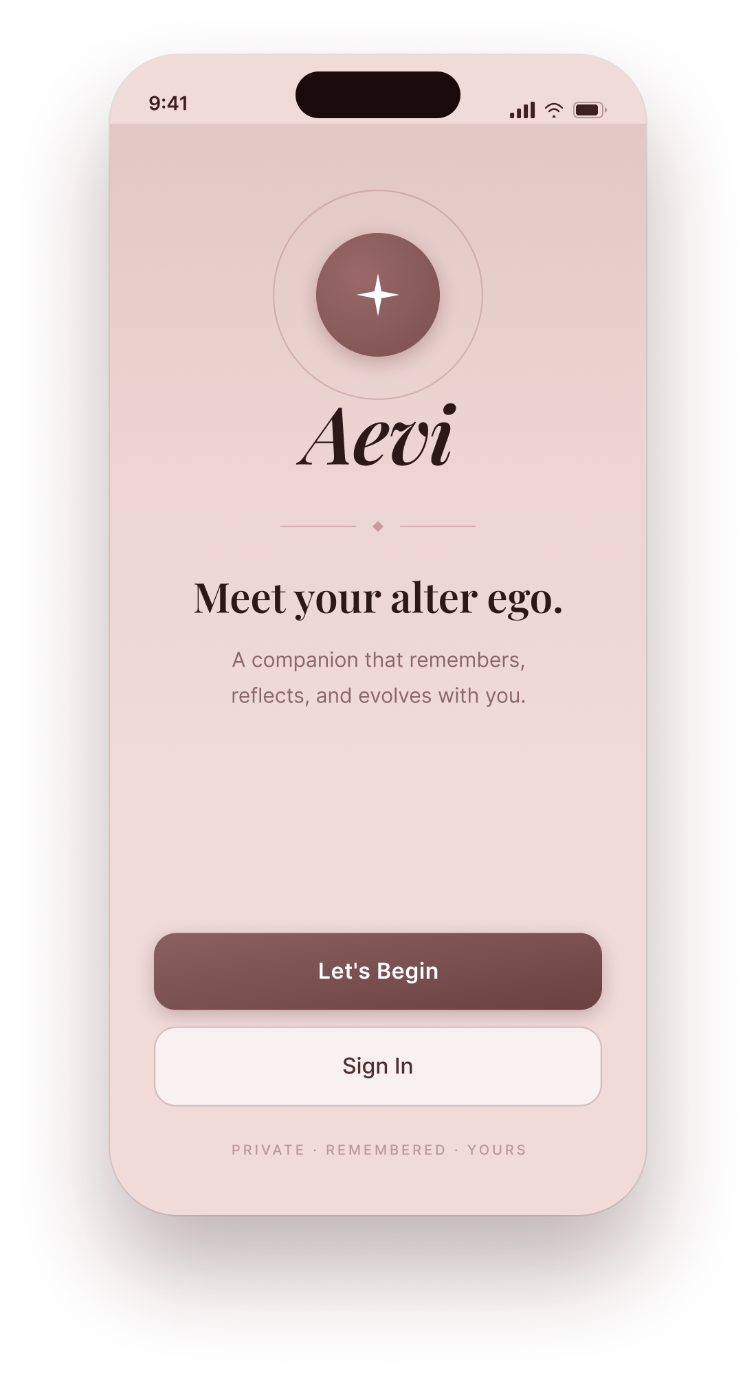
Welcome
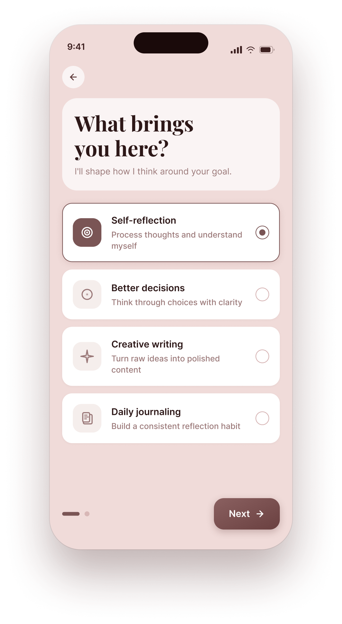
Your goals
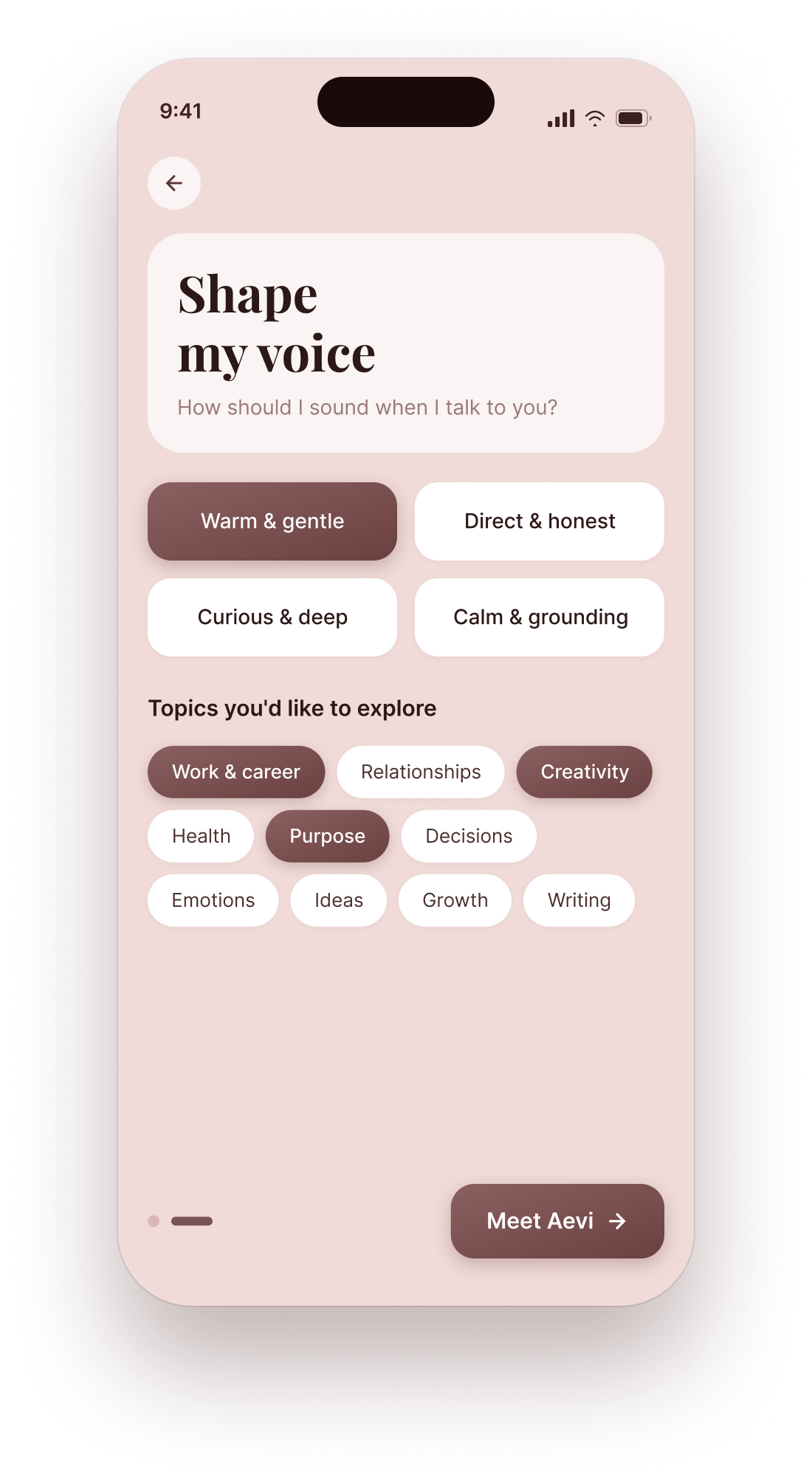
Your voice
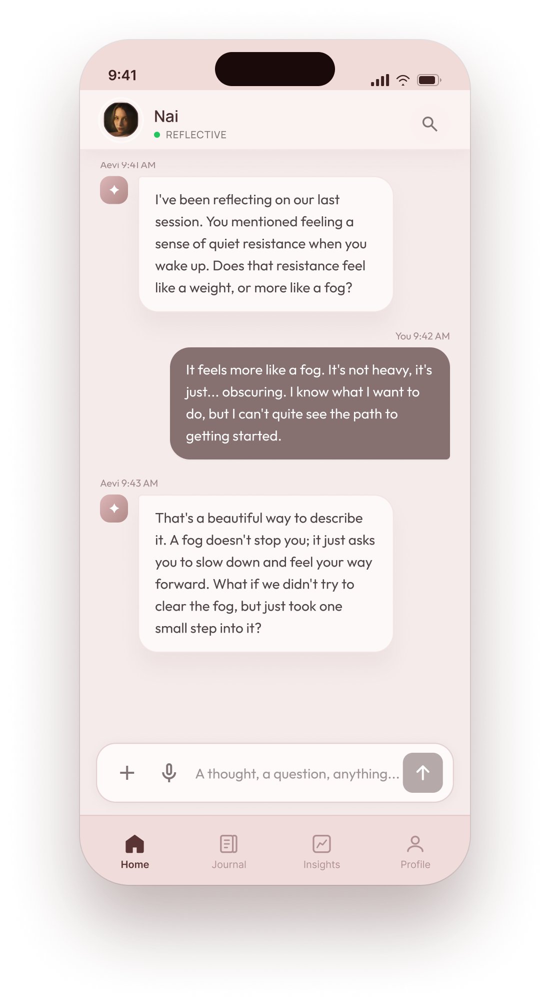
Meet Aevi
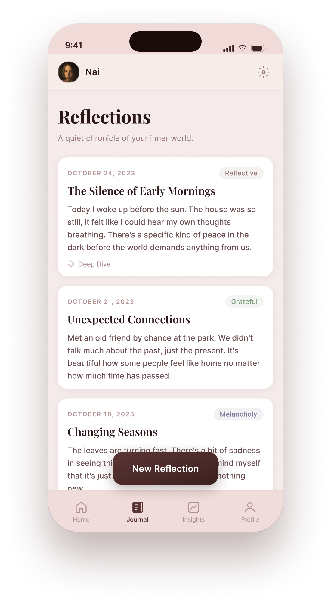
Reflections
The first version of the weekly insight was formatted as a card with a title, three bullet points, and a score. Beta testers described it as feeling like a school report. I redesigned it as a single flowing paragraph with no score, written in second person. Engagement with the insights feature increased significantly in the following week. The lesson: data presented as narrative is more likely to be read than data presented as data.


Aevi launched on Google Play after a 14-day production review with 35 beta testers and 247+ waitlist signups. More importantly, it proved that a solo designer using AI-assisted development tools can take a product from zero to live on a major platform in weeks, not months. Every design decision, component, and interaction was shipped by one person.
