

Artura — Art Discovery Platform
UX/UI Design · End-to-End · 2024
Overview
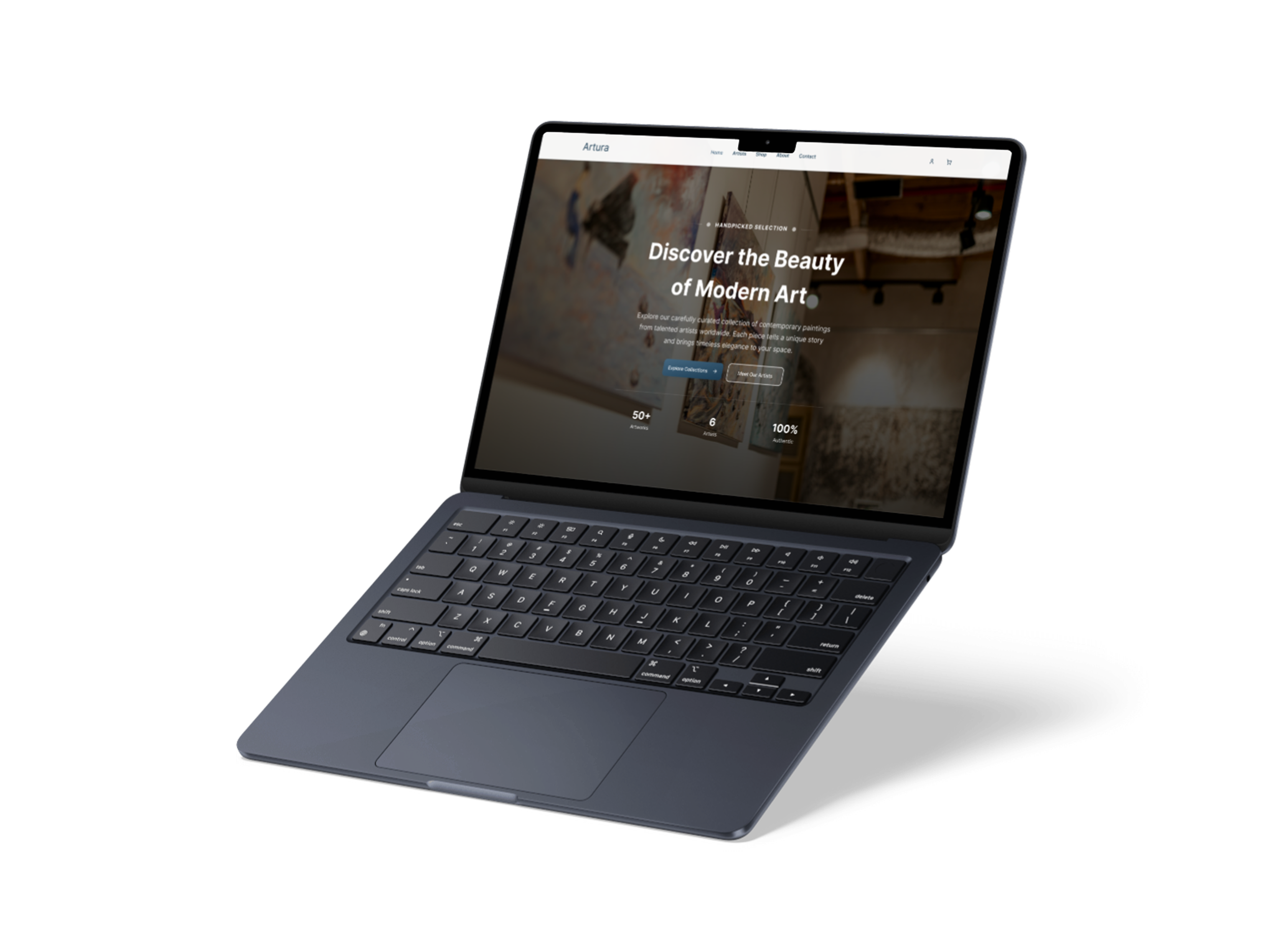
Artura is an art discovery platform that connects collectors with contemporary artists. The goal was to design a digital gallery experience that feels as intentional and curated as the art it showcases — elegant, trustworthy, and welcoming to both serious collectors and first-time buyers.
My Role: UX Research · Information Architecture · Visual Design · Prototype Tools: Figma · Squarespace Timeline: 6 weeks
The Problem
Art platforms often feel either cold and intimidating (catering only to serious collectors) or cluttered and market-like (feeling cheap). Neither builds the emotional connection that drives someone to buy original art.
How might we design an art platform that feels approachable, trustworthy, and emotionally resonant — without losing the sense of curation and quality?
Goals
Build trust with first-time collectors through clear storytelling
Give artists visibility and fair representation
Create a browsing experience that mirrors the feeling of walking into a well-curated gallery
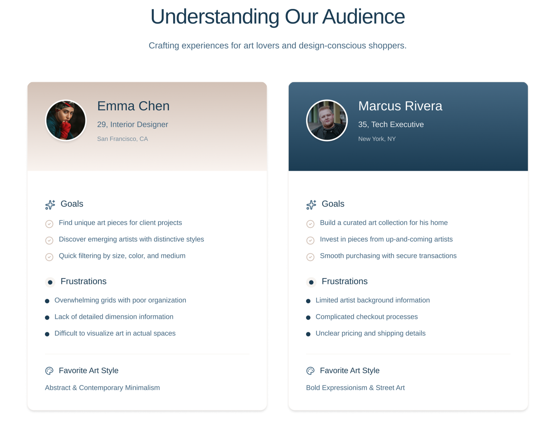
Research & Discovery
I looked at existing art platforms — Saatchi Art, Artsy, and smaller indie galleries — and identified a consistent gap: the human story behind the art was buried. Users said they wanted to know who made the piece and why, not just the price and dimensions.
Key insights:
Collectors feel more confident buying when they can connect with the artist's story
Trust signals (authenticity, sourcing, curation process) reduce purchase hesitation
Navigation needed to be minimal — too many categories overwhelmed users
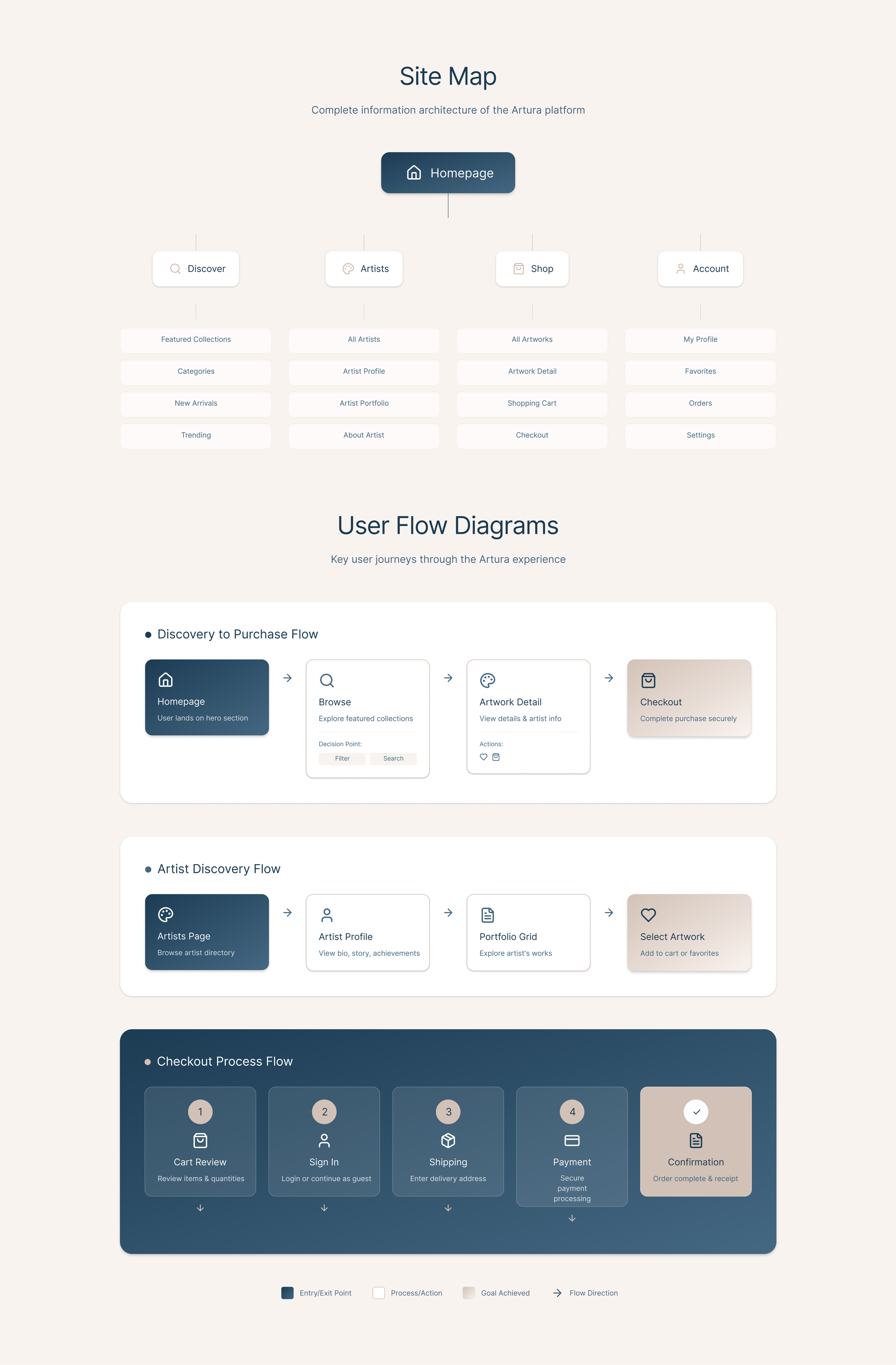
Information Architecture
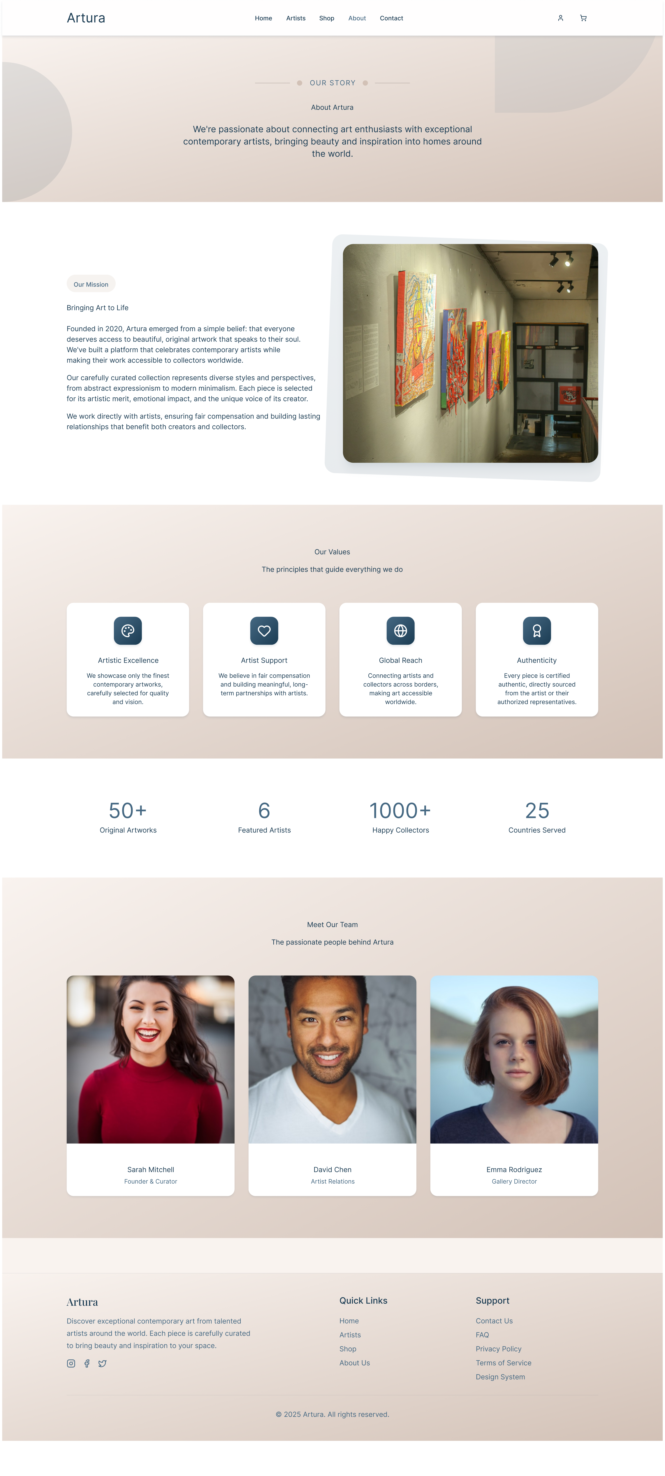
I structured the platform around three core journeys: browsing the shop, discovering artists, and understanding Artura's mission. The About page was treated as a trust-building destination — not an afterthought.
The navigation was simplified to five items: Home · Artists · Shop · About · Contact
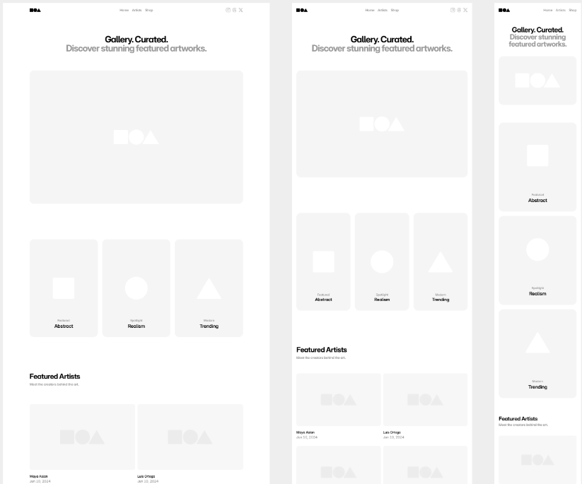
Wireframes & Early Explorations
Before moving into high-fidelity design, I mapped out the key page structures in low-fidelity wireframes. The focus was on hierarchy — what information should a visitor encounter first, and what should earn their attention as they scroll.
The About page went through two iterations. The first version placed the values section above the mission text, but user feedback during informal testing suggested people wanted context before commitment — they needed to understand what Artura is before being told what it stands for. I reordered accordingly.
The shop and artist listing pages were wireframed in parallel to ensure the navigation logic felt consistent across browsing contexts.
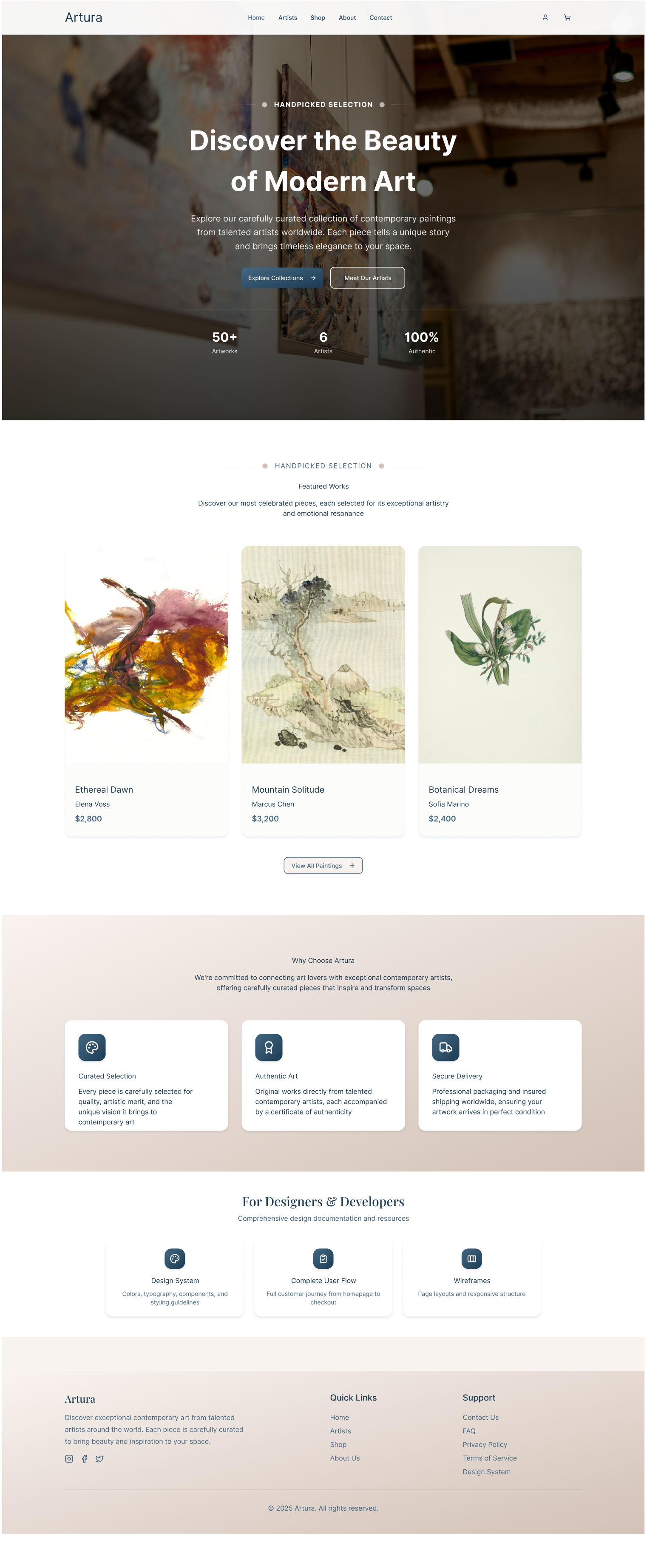
High-Fidelity Design
With the structure validated, I moved into high-fidelity. The visual direction was anchored in warmth and restraint — a muted beige and deep navy palette that references the feeling of a physical gallery without mimicking one literally.
Every decision was made to reduce friction and build trust. Generous white space, clean typography, and a soft colour palette keep the focus on the art and the people behind it.
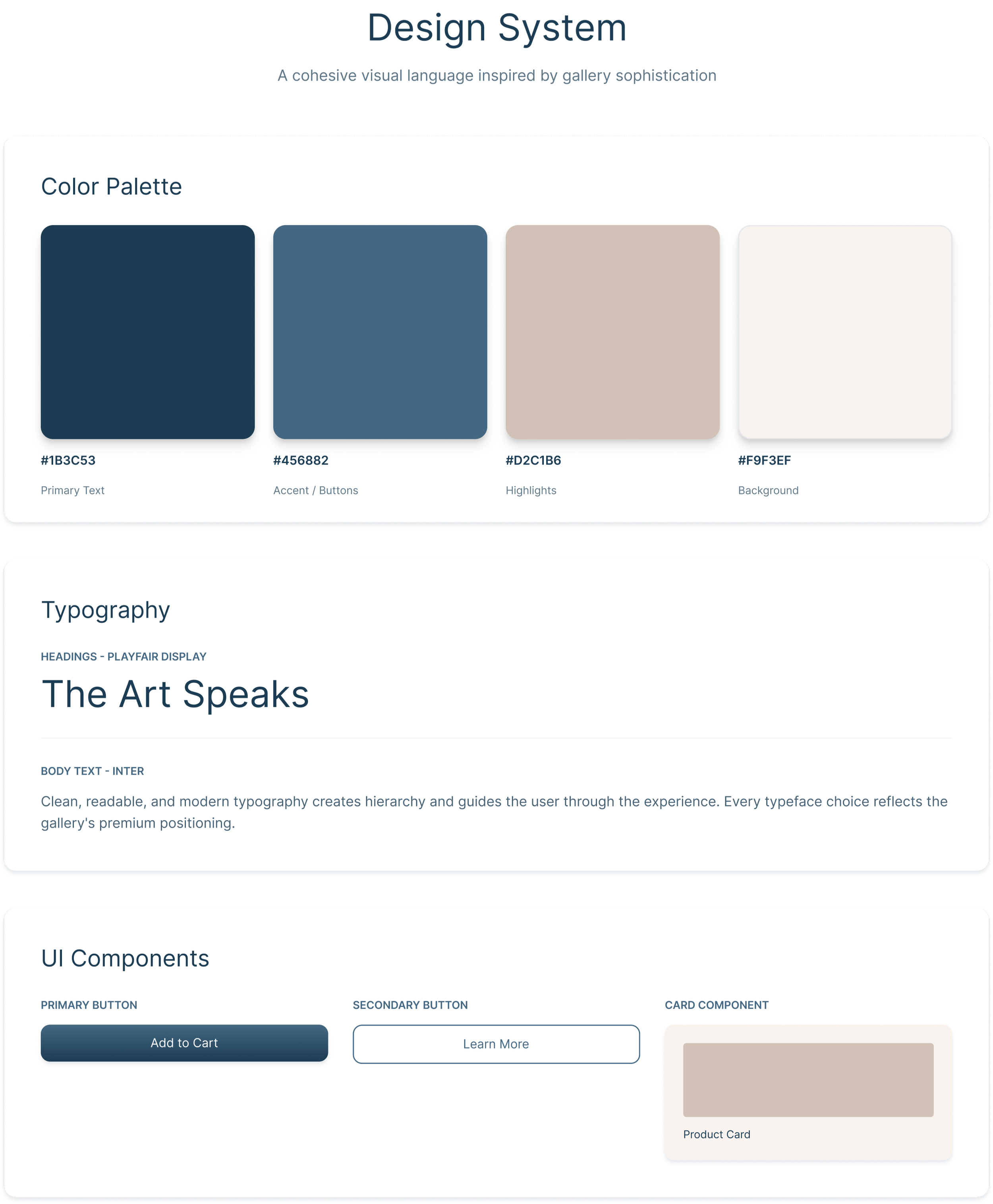
Design System
The visual language was kept intentionally restrained — every element chosen to support the art, not compete with it.
Colour
A warm beige background paired with deep navy creates a gallery-like atmosphere. Colour is used sparingly, reserved for icons and key UI elements to draw attention without noise.
Typography
A serif display font carries the brand's editorial tone for headlines. Body text uses a clean sans-serif for readability. The contrast between the two creates hierarchy without needing additional styling.
Iconography
Icons are simple, rounded, and consistent in weight. Each one sits inside a navy container — giving the values section visual anchoring while keeping individual icons from feeling decorative.
Spacing & Layout
Sections are separated with generous breathing room. Cards are used as the primary content container — consistent padding, soft shadows, no borders — keeping the grid structured but light.
Components
Core components include navigation bar, stat row, value card, team card, and footer. Each was designed to work independently and cohesively across pages.
What I Would Improve
Add an artist profile page with richer storytelling (video, process shots)
Test whether users read the About page before or after browsing the shop — and optimise the flow accordingly
Introduce a "New Arrivals" or personalised recommendation section for returning collectors
Outcome
Artura's design system established a consistent, gallery-quality visual language that could scale across pages. The About page in particular communicates warmth and credibility — building the emotional trust that turns a browser into a buyer.