
Askfritz
AI-Powered HR Services Platform
Designing a clear, trustworthy, and role-driven experience for an AI-powered HR SaaS platform built for both HR professionals and the employees they manage.
UX & UI Design · SaaS Web Application · Real Client · Enterprise / AI · Desktop-first
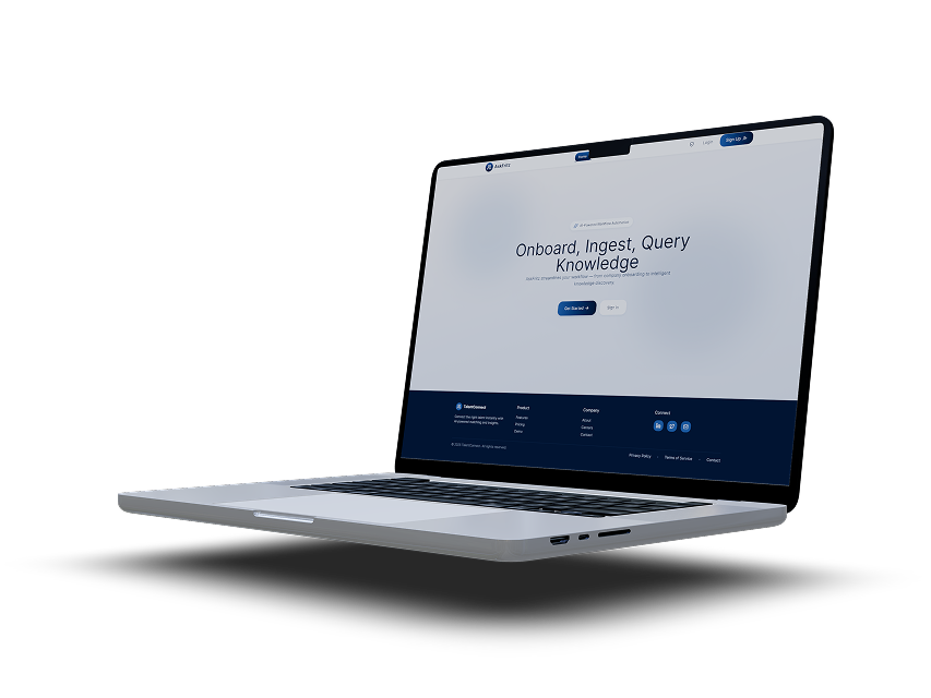
Platform
SaaS Web Application Desktop-first, responsive. Designed in Figma.
Deliverables
UX research · User flows Personas · Journey maps High-fidelity UI · Design system Handoff documentation
My Role
UX & UI Designer end-to-end ownership from research and problem framing through to high-fidelity UI, design system creation, and developer handoff.
Users
Two distinct user types: Company / HR Admins and Employees — each with their own dashboard and access level.
The Problem
HR professionals often work across fragmented systems while managing large volumes of employee and candidate data. Introducing AI into these workflows adds significant complexityparticularly around trust, transparency, and usability.
The central tension was this: when AI makes a recommendation and the reasoning is invisible, the user either ignores it entirely or acts on it blindly. Neither is acceptable in an enterprise HR context where decisions affect people's careers and livelihoods.
Key Challenges
Making AI-powered outputs understandable and explainable not just accurate. Reducing cognitive load across data-heavy screens without losing information depth. Designing separate but coherent experiences for two completely different user types. Ensuring the product felt enterprise-ready while remaining approachable for non-technical users.
Design Principles
Before touching a single wireframe, I established four principles that would guide every decision from navigation structure to how AI match scores were displayed. These acted as a shared language between myself, the product stakeholders, and engineering throughout the project.
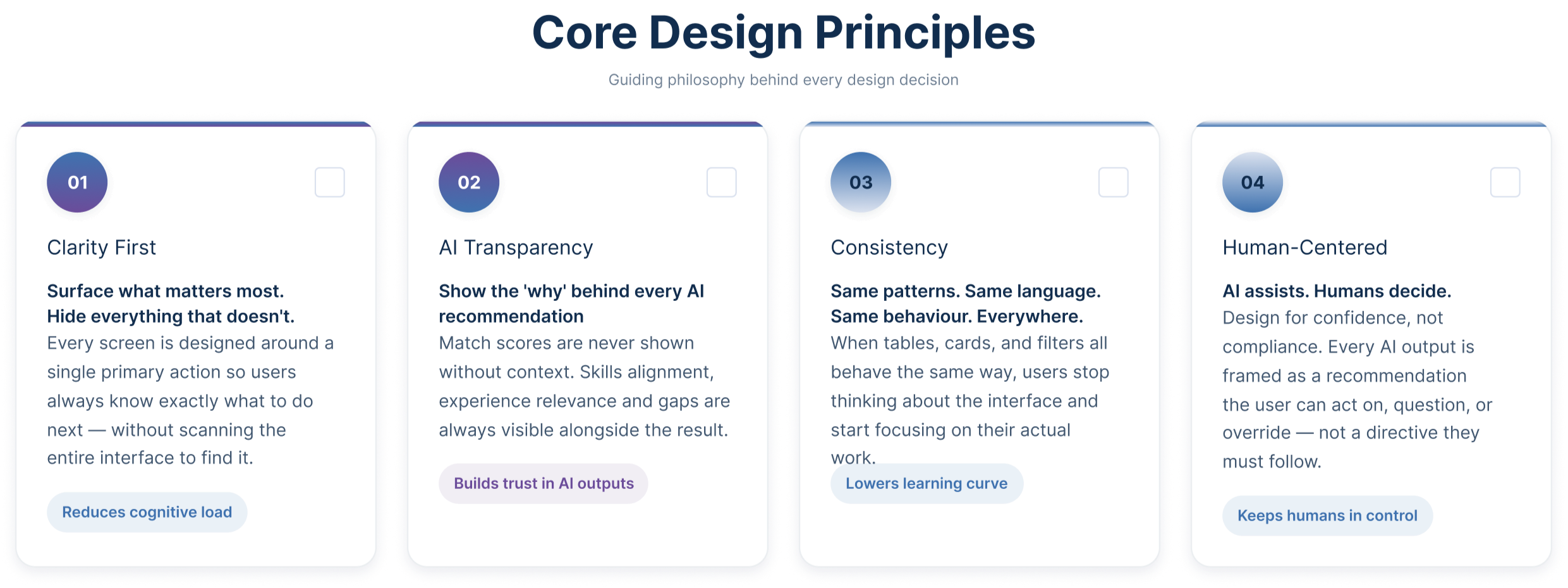
These principles were not abstract ideals. Each one addressed a specific failure mode I identified during research: screens becoming too complex, AI outputs feeling untrustworthy, inconsistent patterns increasing the learning curve, and users feeling like passive recipients of AI decisions rather than active, informed decision-makers.
Understanding the Users
AskFritz serves two fundamentally different users who share the same platform but never interact with it in the same way. Understanding both was essential not just their goals, but how they think, what they fear, and where the experience could break down for each of them.
The research phase focused on stakeholder discussions, domain immersion, and pattern analysis from existing HR workflows. I paid particular attention to two things: how HR professionals interpret AI-generated outputs, and what employees actually need from a work management tool to feel in control of their day.
User Personas
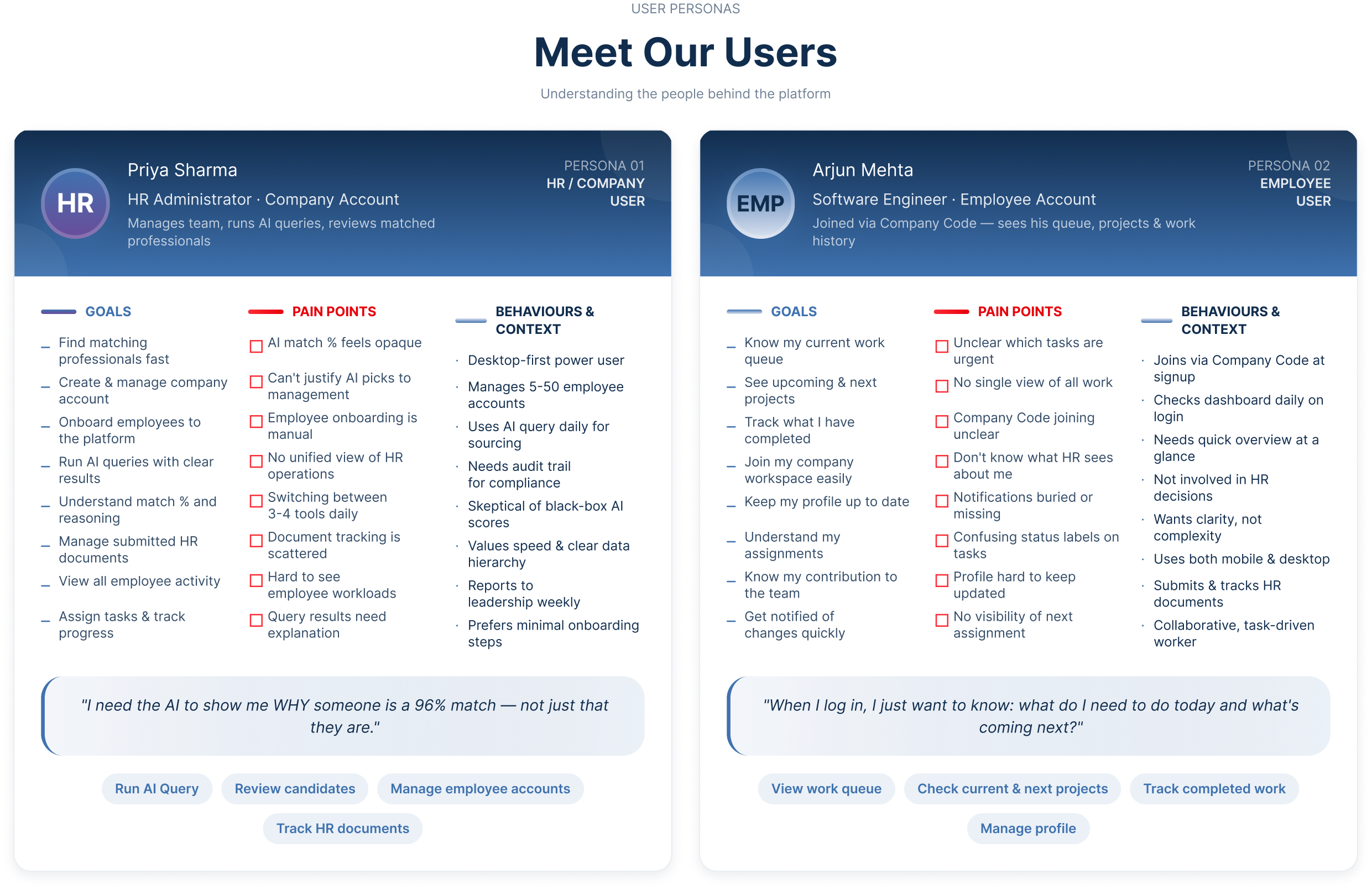
"Two users. Same platform. Completely different needs — and they should never see each other's world."
Storyboard
Before building flows or wireframes, I mapped out the human story behind each user's experience what triggers them to open AskFritz, what they are trying to accomplish, and how the design either supports or frustrates that goal at each step.
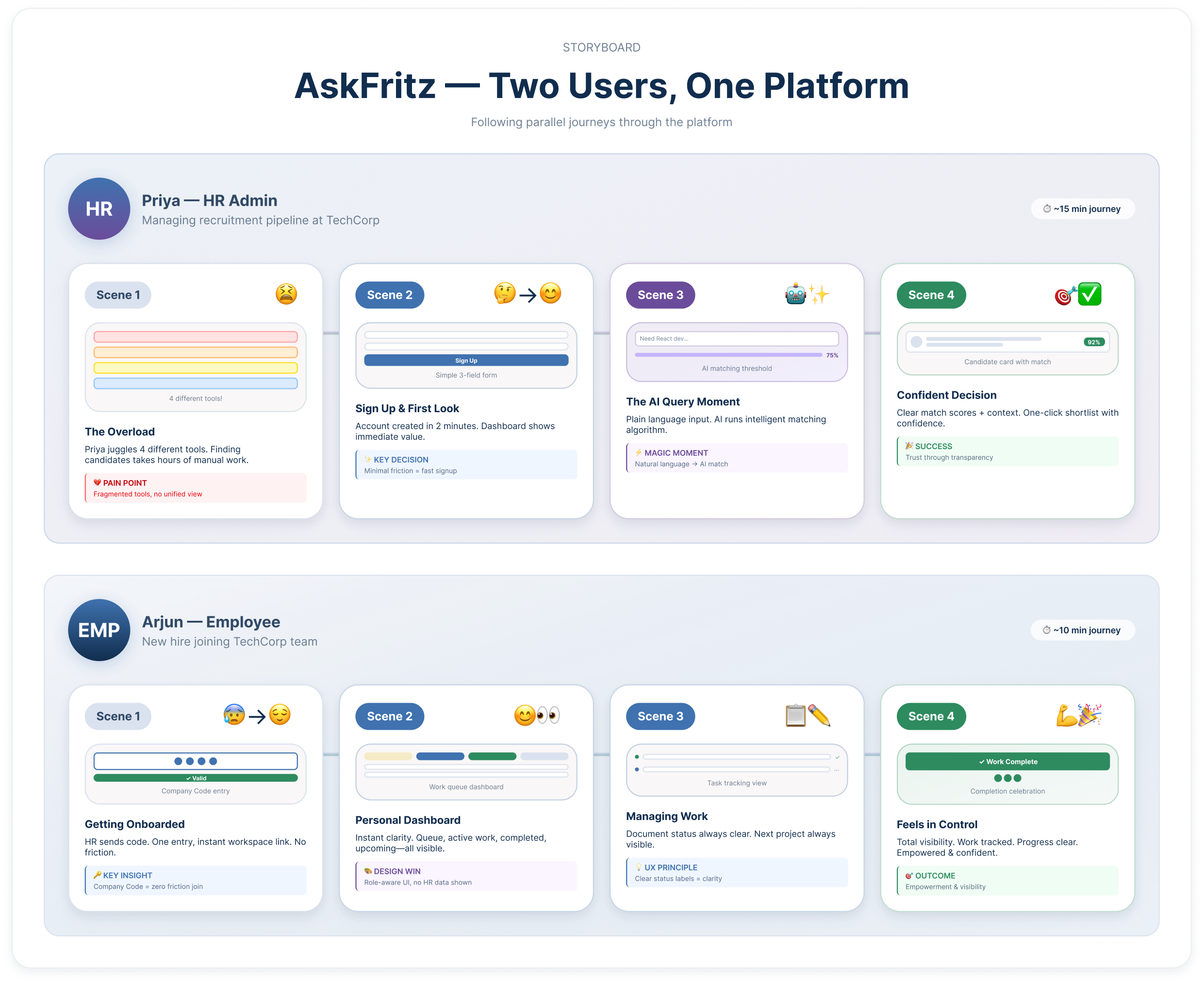
The storyboard revealed something important early on: both users' journeys have a single moment of highest anxiety. For Priya, it is the AI results screen the moment she has to decide whether to trust a match score she didn't generate. For Arjun, it is the signup screen, specifically the Company Code field, where a vague error message could immediately derail onboarding. Identifying these moments early shaped the design priority order for the entire project.
User Journey Map
The journey map traces both users' experiences side by side across five stages: Sign Up, First Login, Core Task, Decision Point, and Outcome. Mapping them together made the role separation design decisions much clearer it showed exactly where each user needed something different, and where the same underlying system needed to present a completely different face.
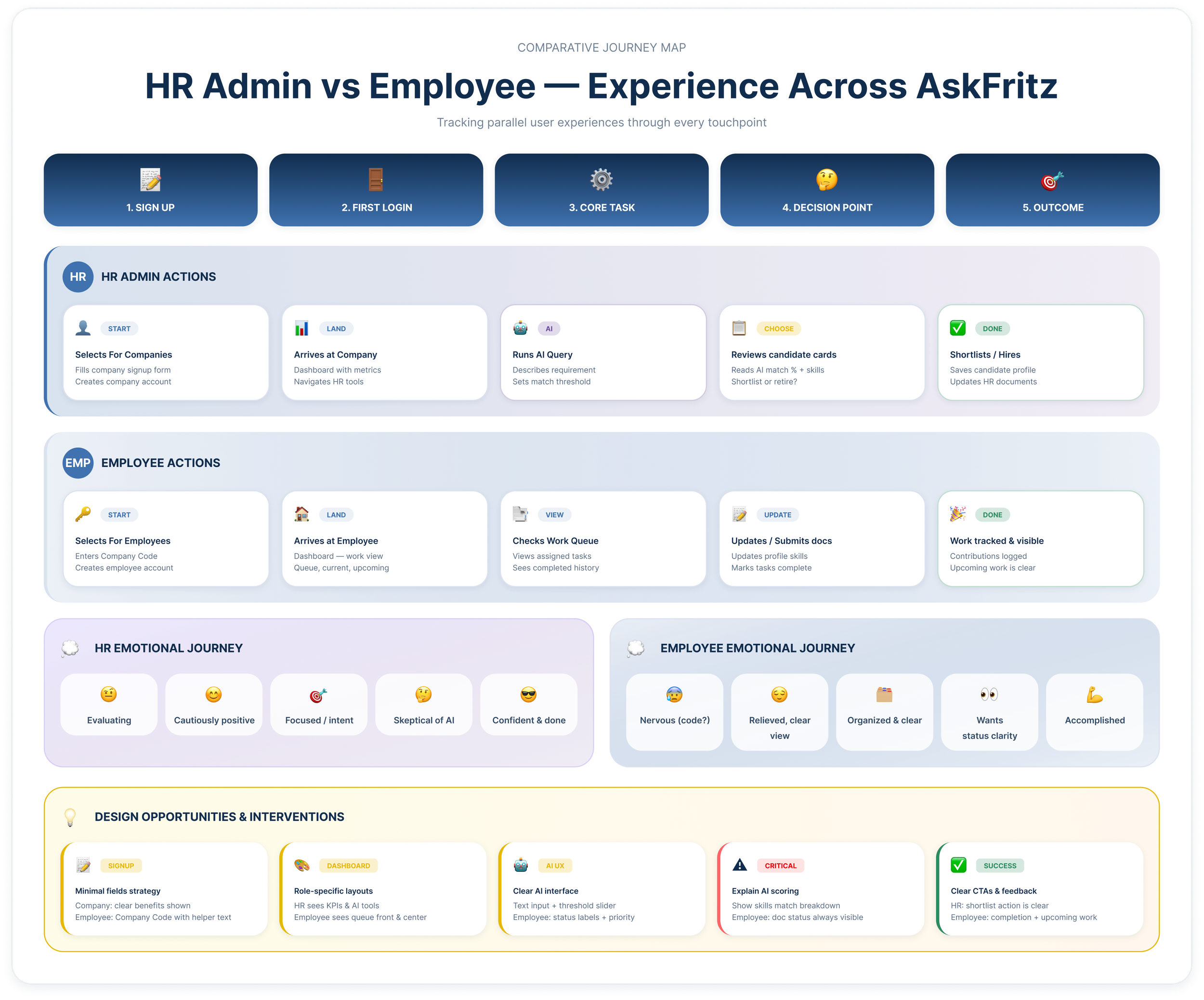
The Critical Moment of Truth
Stage 4 — the Decision Point is the most important stage in the HR Admin's journey. This is where Priya reviews AI-generated candidate results and decides whether to act on them. If the match percentage is not accompanied by visible reasoning skills breakdown, experience alignment, and any notable gaps she loses trust in the system entirely and the platform fails at its core promise.
For Arjun, the equivalent moment is Stage 4 as well the point where he submits documents and needs to clearly see their status. Ambiguous labels like "processing" without context create exactly the same loss of confidence in the product, just for a different reason.
Both insights directly shaped specific components in the final UI: the AI score explanation panel on candidate cards, and the clear status tag system on the employee document table.
Information Architecture
Before wireframing, I mapped the full platform structure. The most important decision at this stage was how to handle role separation ensuring that each user type accessed exactly what they needed, without being overwhelmed by functionality that was not relevant to them.
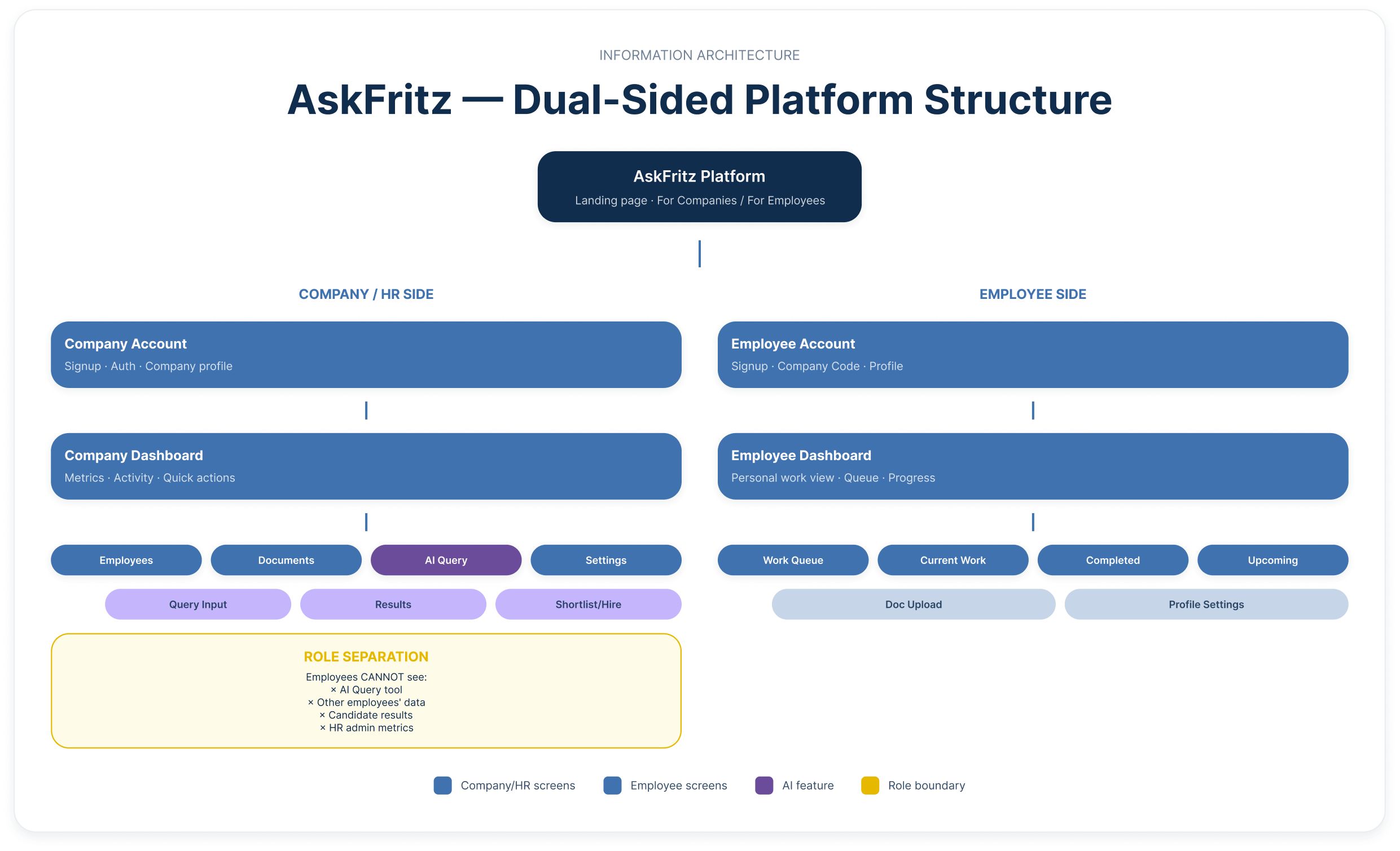
Key Architecture Decisions
The platform splits immediately at the landing page into two distinct paths. The Company side gives HR admins access to the AI Query tool, employee management, document tracking, and admin settings. The Employee side gives workers access to their personal work dashboard queue, current projects, completed work, and upcoming assignments plus document upload and profile management.
Critically, the AI Query tool is completely invisible to employees. They never encounter it, never see candidate data, and never have access to other employees' profiles. Role-based access was enforced at the component level not the page level so both user types experience a coherent, uncluttered environment tailored entirely to their context.
The AI Query feature received the deepest information hierarchy on the HR side, with dedicated sub-screens for query input, results view, score explanation, and shortlisting because this is the primary value-delivery mechanism of the entire platform.
User Flows
The dual user flow maps both paths in full — from the shared landing page through to each user's final goal. The two paths diverge immediately at account type selection and never cross again. Each flow accounts for new and returning users, error states, and feedback loops.
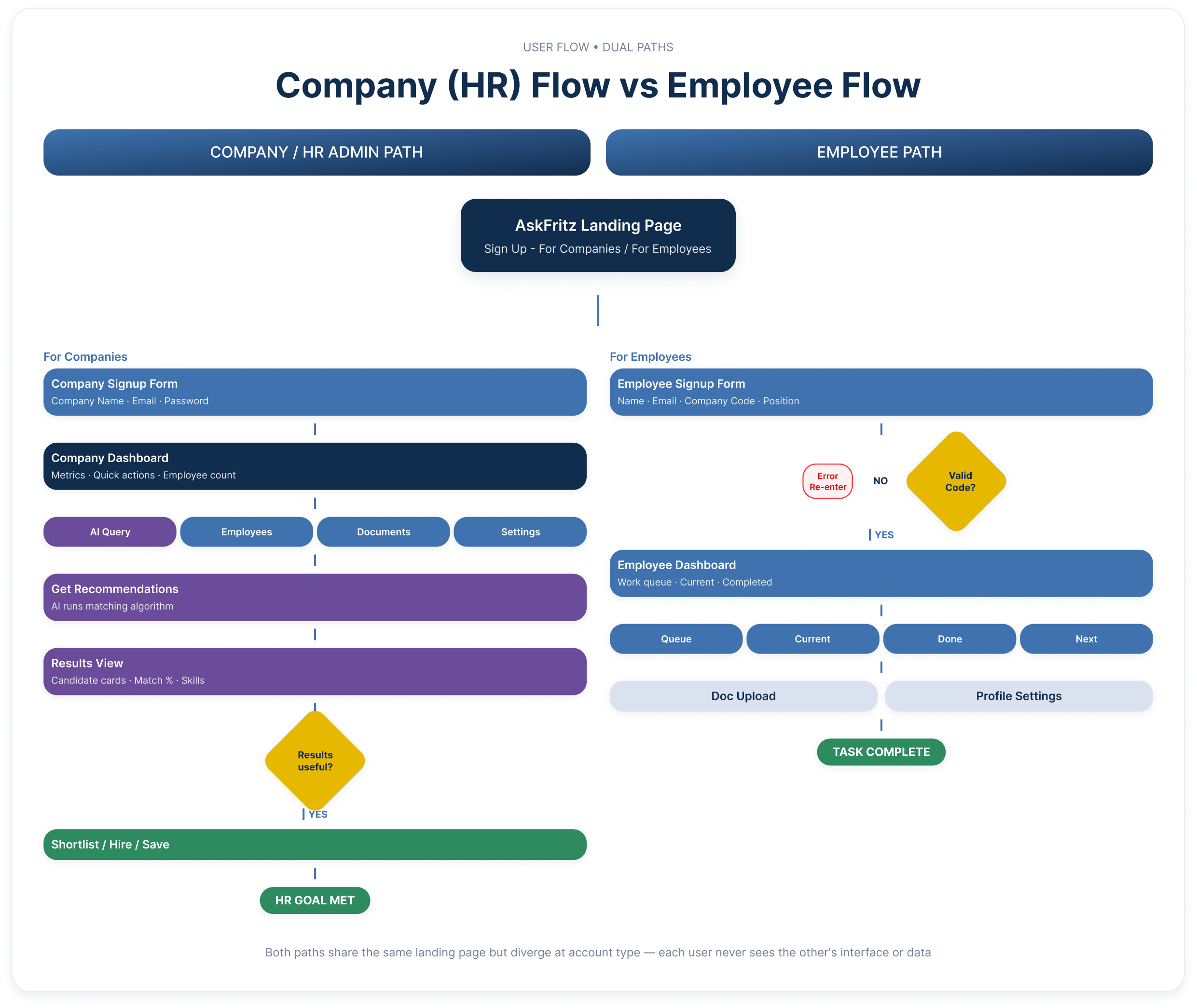
HR Admin Flow Highlights
The HR Admin path moves from landing page → company signup → company dashboard → navigation to the AI Query tool → describing a requirement in plain language → setting a minimum match threshold → receiving AI-ranked candidate results → reviewing match scores with explanation → shortlisting or refining the query if results are unsatisfactory. The refinement loop was a deliberate design decision: users should never hit a dead end when AI results don't meet expectations. Instead, they are guided back to the query input with their previous entries preserved.
Employee Flow Highlights
The Employee path moves from landing page → employee signup with Company Code validation → personal work dashboard → work queue, current projects, completed work, and upcoming assignments → document upload and profile management. The Company Code validation step includes a clear error state with guidance — identified as the highest-anxiety moment in the employee journey — ensuring that a wrong code never leaves a new user stranded without a path forward.
UI Design & Visual Direction
The visual design was anchored in a single brief: feel trustworthy. For an enterprise product where users are making decisions about people and data, a calm, clear, and consistent visual environment is not just an aesthetic choice — it is a functional requirement.
Colour & Typography
The palette is built on a blue-navy foundation — Primary Blue (#3F72AF) for interactive elements and primary actions, Deep Navy (#112D4E) for headings and structural elements, and a light surface tone (#DBE2EF) for borders, dividers, and card backgrounds. The result is a clean, professional environment that reads as calm and reliable rather than aggressive or over-stylised. Typography follows a strict hierarchy optimised for data-dense screens clear heading weights, readable body sizes, and distinct label styles for data values, status tags, and metadata.
Layout & Spacing
All screens follow an 8pt grid, ensuring consistent rhythm across every state and breakpoint. Spacing was used as a hierarchy signal tighter groupings indicate related content, generous spacing signals section breaks and primary actions. Every screen was designed with a single primary action in mind, so users always know what to do next without scanning the entire interface
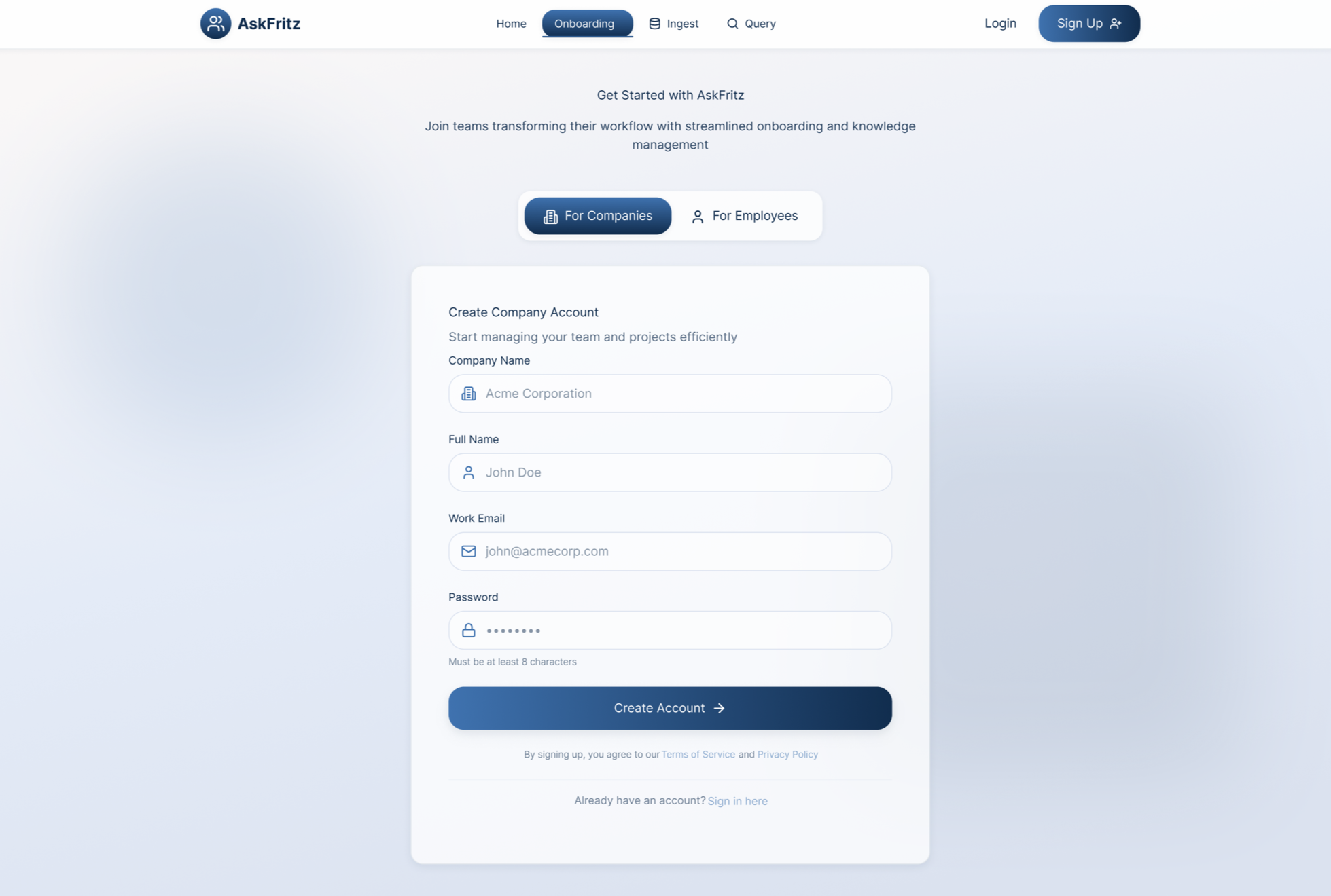
Company account creation — Minimal fields, clear labelling, and a single primary CTA. No unnecessary steps between landing and getting started.
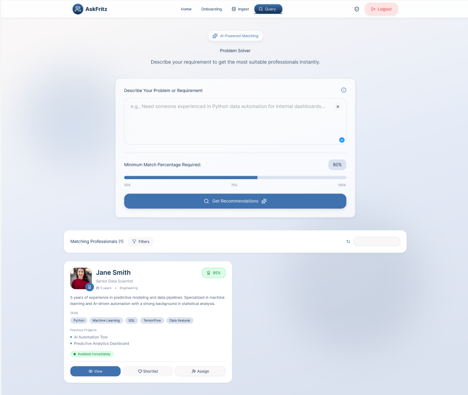
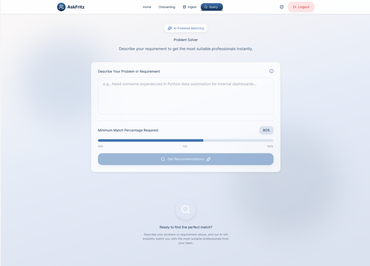
Caption: AI Query — Plain language input with a minimum match percentage slider. The interface makes running a complex AI search feel as simple as writing a brief.
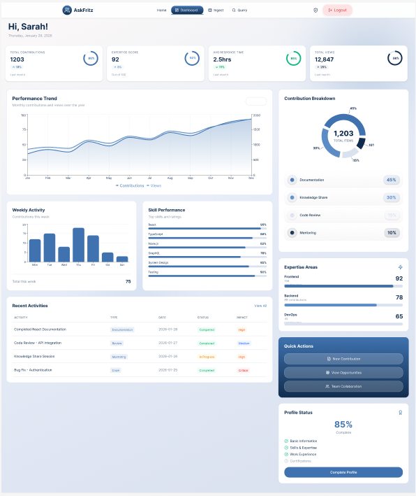
Employee dashboard — A personal, role-specific view showing current queue, document statuses, and upcoming project assignments. No HR data is visible here.
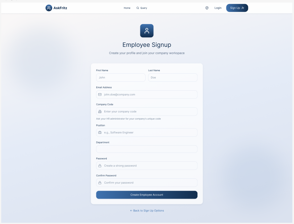
Employee onboarding — The Company Code field is the critical touchpoint. Clear helper text and instant validation feedback reduce anxiety at the highest-friction moment of the employee journey.
AI candidate results — Each card surfaces match percentage, key skills, seniority level, and action buttons. The AI's output is scannable and actionable without requiring the user to dig for context.
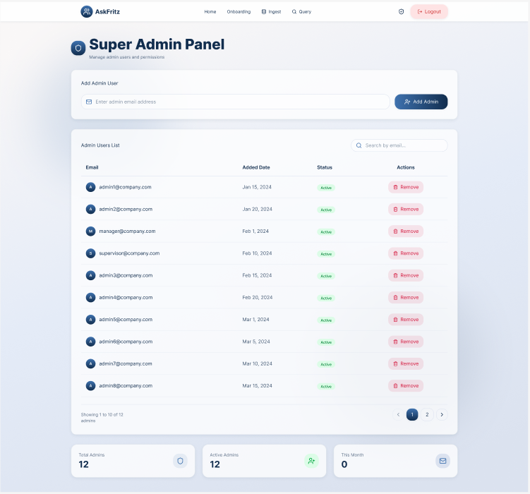
Admin management interface — Structured table layouts and consistent interaction patterns support efficient team management with minimal cognitive load.
Key UX Decisions
1. Split at the Entry Point — Not Midway
Rather than showing all users the same interface and restricting access later, the platform splits immediately at the landing page. Users select "For Companies" or "For Employees" before they ever sign up. This means the signup form, dashboard, navigation, and every subsequent screen is purpose-built for their role. Neither user ever sees a menu item, button, or page that is not relevant to them.
2. AI Transparency as a Design Component
The most critical design decision in the entire project was how AI match scores were presented. Displaying a percentage without context is meaningless and worse, it erodes trust. Every AI-generated candidate result includes a visible breakdown: skills aligned to the query, experience relevance, seniority match, and any notable gaps. This component was non-negotiable. Without it, HR admins would not act on AI recommendations, and the platform's core value proposition would fail.
3. Company Code as Zero-Friction Onboarding
Employees join their company workspace by entering a Company Code during signup a short identifier generated and shared by the HR admin. This removes the need for manual employee invitation flows, CSV uploads, or admin approval steps. The key design challenge was making the Company Code field clear and forgiving: the input validates instantly, the error state is specific ("That code doesn't match any company check with your HR team"), and successful validation is immediately confirmed with a green indicator.
4. Progressive Disclosure for AI Depth
The AI results screen shows a clean summary view by default match percentage, key skills, and core actions. Deeper information (full skills breakdown, experience timeline, skill gap analysis) is revealed only when the user actively requests it. This keeps the primary results view fast and scannable while ensuring that the depth is always available for users who need to justify a decision to a manager or stakeholder.
5. Action-First Navigation
Core tasks running an AI query, checking the work queue, uploading a document are surfaced immediately in the dashboard and primary navigation. Users should never arrive at the platform and wonder where to start. The dashboard for both user types is designed around the most common task for that role, with secondary features accessible but never competing for attention at the primary view.
Design System
To support consistency, scalability, and efficient collaboration, I built a component-based design system tailored to the needs of an enterprise AI-driven HR platform. The system acts as a shared foundation between design and engineering — ensuring that patterns remain coherent as the product grows and new features are added.
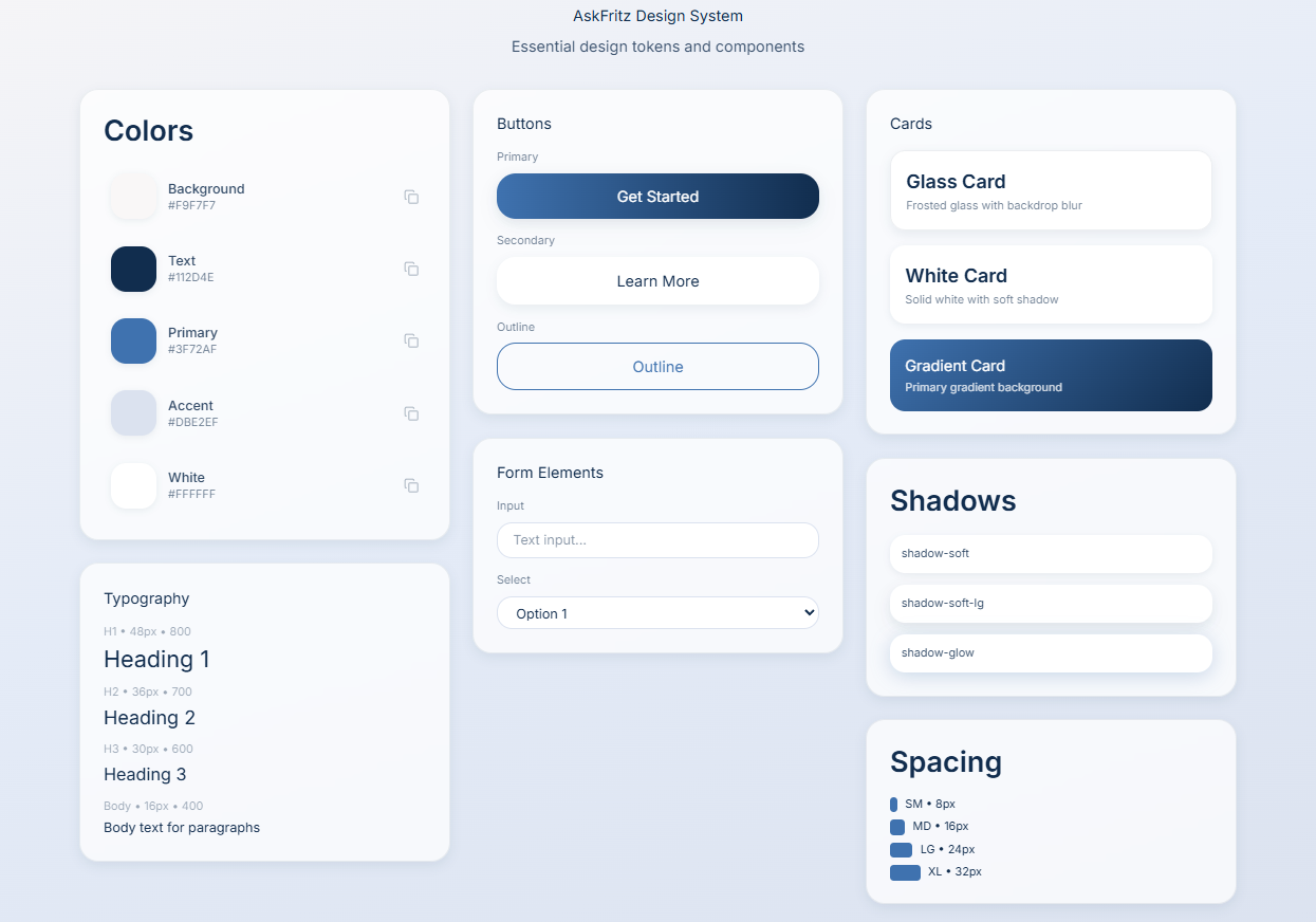
The design system enabled faster iteration without sacrificing consistency. Every new screen or feature could be assembled from existing components rather than being designed from scratch, which significantly reduced both design time and the risk of introducing visual inconsistencies. For engineering, the system provided clear, reusable specifications — reducing the back-and-forth on implementation details and supporting a smoother handoff process.
End-to-End Flow Walkthrough
This walkthrough demonstrates the primary user flows for both user types — showing how Company Administrators and Employees interact with AskFritz from signup through to their core task completion. The video highlights key design decisions around role separation, the AI query experience, and the employee work dashboard.
Outcome & Learnings
What Was Delivered
A complete, end-to-end UX for a dual-sided AI-powered HR platform — covering high-fidelity screens for all primary user flows across both user types, a role-based information architecture, a scalable component design system, and comprehensive handoff documentation for engineering.
Impact
Delivered a coherent experience across two fundamentally different user types within a single product. Established strong visual hierarchy and consistent interaction patterns that reduce cognitive load on data-heavy screens. Built a design system that supports faster feature development and reduces design debt as the product scales. Supported smooth collaboration between design, product, and engineering through shared component specifications. [H4] What I Learned [BODY] This project reinforced three things I now consider fundamental when designing AI-powered products.
Trust is built in the details, not in the headline. Users form their opinion of an AI system in the first moment they see its output. The labels, the confidence indicators, the explanation — how the result is presented matters more than the accuracy of the model itself. A 96% match score with no context is less useful than a 78% score with a clear skills breakdown.
Role separation is a UX problem before it is a permissions problem. Deciding what each user sees is not just a technical access-control question — it is a design question. Every time a user encounters something irrelevant to their role, it adds noise and reduces their trust in the product's understanding of them. Getting the split right early, at the entry point, shapes everything downstream.
Consistency is the most underrated form of good UX. When every table, card, and filter behaves the same way throughout the platform, users stop thinking about the interface and start thinking about their work. This sounds straightforward. In practice, maintaining it across two distinct user experiences, multiple screen types, and a growing feature set requires constant discipline.
"Designing for AI isn't about making the algorithm visible. It's about making the human feel capable."