

MINTLY
Personal Finance Management App
UX / UI Case Study
Nandini Miriyala · Lead Product Designer · Munich, Germany
nandinimiriyala.com · nandinimiriyala14@gmail.com
Lead Product Designer | 3 Months | Web + Mobile | Figma · FigJam
OVERVIEW
One app for your entire financial life.
Mintly is a personal finance management application designed to give users a complete, real-time picture of their financial health — balances, spending, investments, and savings — all in one interface. It bridges the gap between traditional banking apps and sophisticated financial tools, without the complexity.
This case study documents the full end-to-end design process: from discovery research and user personas through information architecture, interaction design, and final high-fidelity UI. Every design decision was driven by user evidence not personal taste.
KEY RESULTS
→ 70% reduction in time to find account balance
→ 82/100 SUS Score classified as "Excellent"
→ +67 Net Promoter Score from prototype testers
→ Task completion rate: 55% → 91% on key transaction tasks
THE PROBLEM
Why users struggle with personal finance apps today.
Most people manage their money across multiple disconnected tools. Banking apps show transactions but lack budgeting intelligence. Budgeting apps require manual data entry. Investment apps exist in silos. The result: financial anxiety, missed savings goals, and decision paralysis.
"I have three different apps for my bank, investments, and budgeting. I never have a clear picture of my total financial health at once."
Research interview participant
THE CORE PAIN POINTS
01 · Fragmented data across 3+ apps creates anxiety and blind spots in financial health
02 · Data is visible but not actionable apps show numbers without guidance on next steps
03 · Poor information hierarchy buries critical information under layers of navigation
04 · Investment tracking exists in silos, completely disconnected from everyday banking behaviour
05 · Mobile apps feel like stripped-down afterthoughts not first-class experiences
USER RESEARCH
What we discovered in the field.
Before designing a single screen, I conducted a structured research phase to understand the mental models, behaviours, and frustrations of everyday finance app users.
RESEARCH METHODS
5 in-depth user interviews (30–45 minutes each)
Competitive analysis of 6 leading finance apps Mint, YNAB, Robinhood, Chase, Revolut, Monzo
Affinity mapping to cluster themes from interview notes
Jobs-to-be-Done framework to identify core user motivations
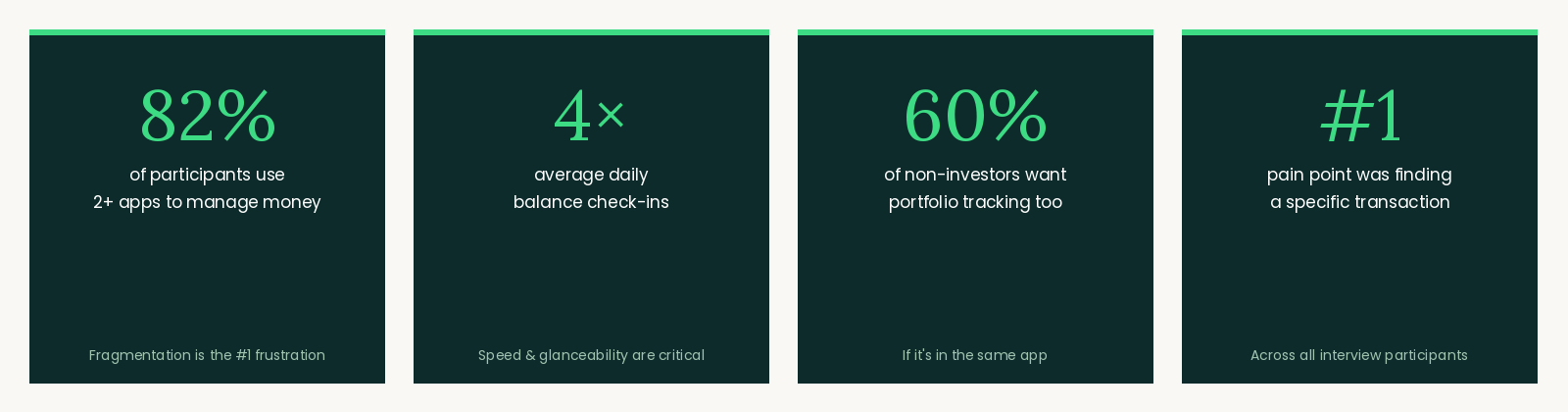
KEY FINDINGS
82% of participants use 2 or more apps to manage money fragmentation is the single biggest frustration
4× average number of times per day users check their bank balance speed and glanceability are critical
60% of non-investor users expressed interest in beginner-friendly portfolio tracking, if it was in the same app they already use
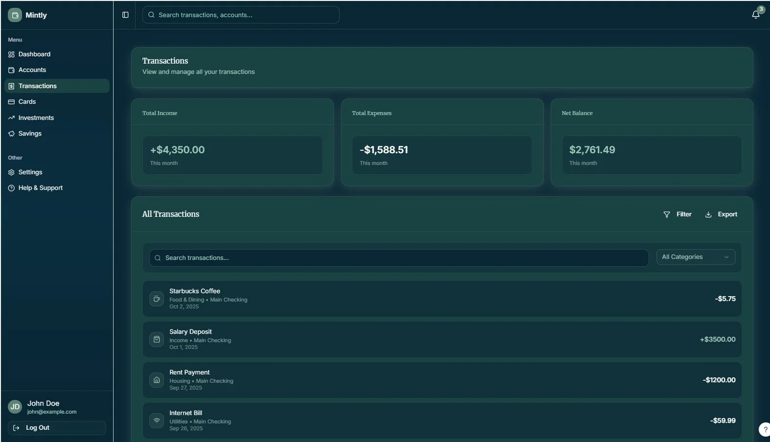
#1 pain point on transaction pages: "I can't find the specific transaction I'm looking for quickly enough"
DESIGN GOALS
What success looked like — for users and for the business.
USER GOALS
See all accounts and balances in one glance, without switching apps
Understand where money is going without manual effort
Complete financial actions — send money, pay a bill — in 3 taps from the home screen
Feel confident and in control of financial decisions
Track progress toward savings and investment goals over time
BUSINESS GOALS
Reduce time-to-value for new users during onboarding
Increase daily active usage through habit-forming design patterns
Differentiate from legacy banking apps with a modern, trustworthy UX
Build user trust through transparency and visible data security cues
Create a scalable design system for future feature expansion
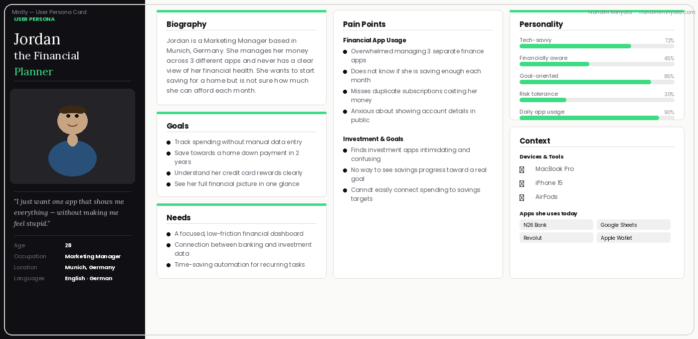
USER PERSONAS
Who we designed for.
Based on research synthesis, I defined two primary personas representing the core user segments. These personas guided every design and prioritisation decision throughout the project.
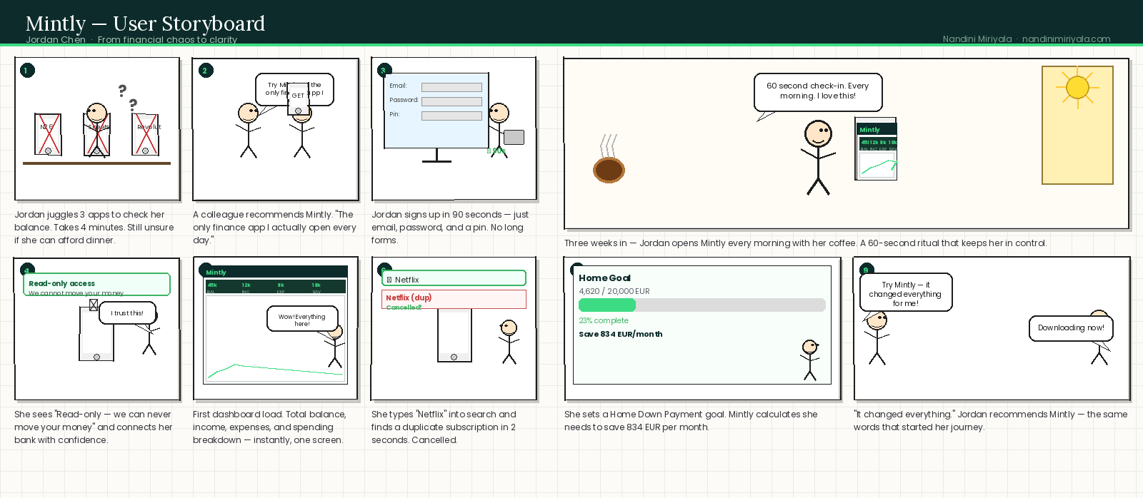
Story Board
USER FLOWS
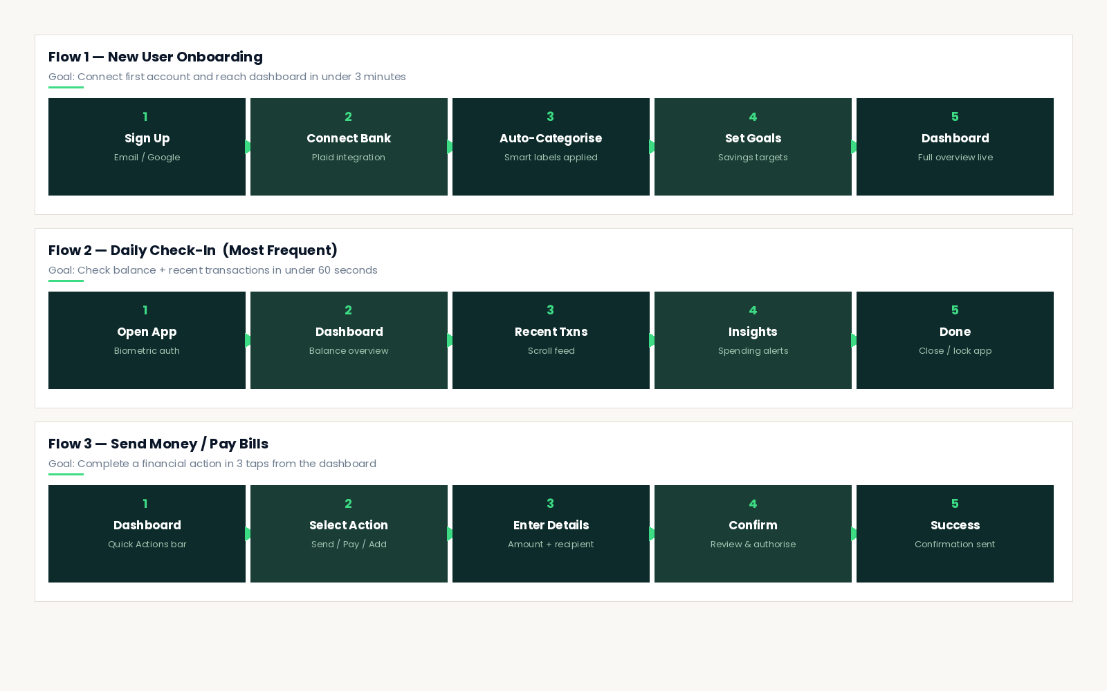
Mapping the core journeys.
Three primary user flows were mapped, tested with real users, and iterated on before a single high-fidelity screen was designed. These flows represent the highest-frequency and highest-value interactions in the app.
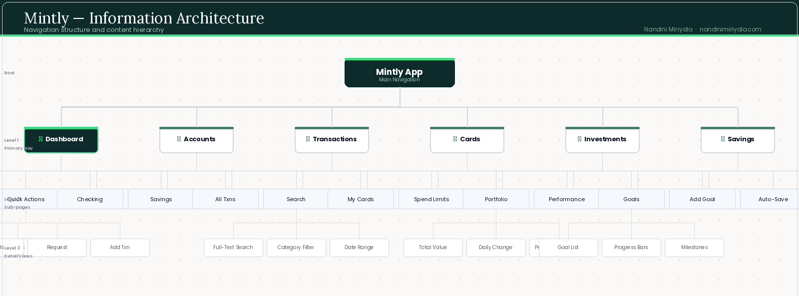
INFORMATION ARCHITECTURE
Navigation was designed around frequency of use and user mental models. Primary navigation items were chosen by analysing which tasks users performed most often and which they expected to reach in a single tap.
DESIGN SYSTEM & VISUAL LANGUAGE
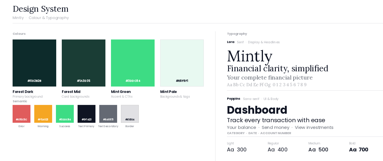
Building a cohesive financial UI.
Mintly's visual language was designed to communicate three qualities that users said they valued most in a finance app: trust, clarity, and intelligence. Every visual decision supports a user's ability to quickly understand their financial state.
COLOUR STRATEGY
Deep forest green (#0D2B2B) is the primary brand colour chosen deliberately for its psychological associations with stability, growth, and money. It signals premium without feeling cold.
Accent mint green (#3DDC84) highlights positive financial data, interactive elements, and calls to action. It's the colour of progress.
Soft warm backgrounds (#FAF8F4) reduce eye strain during extended use. Financial apps are used daily — comfort matters.
TYPOGRAPHY
Lora (serif) for display and headline text — editorial, trustworthy, and distinctive without being decorative. Poppins (sans-serif) for all body, UI labels, and data — clean, highly legible at small sizes, and neutral enough to disappear behind the content.
A strict 4-level hierarchy (Display / Heading / Body / Label) ensures consistent visual rhythm across every screen.
ACCESSIBILITY
· All text meets WCAG AA contrast ratio (4.5:1 minimum)
· Touch targets minimum 44×44px for all interactive elements
· Colour is never the only indicator of state or financial value — icons and labels always accompany colour signals
· Supports system-level font scaling for users with visual accessibility needs
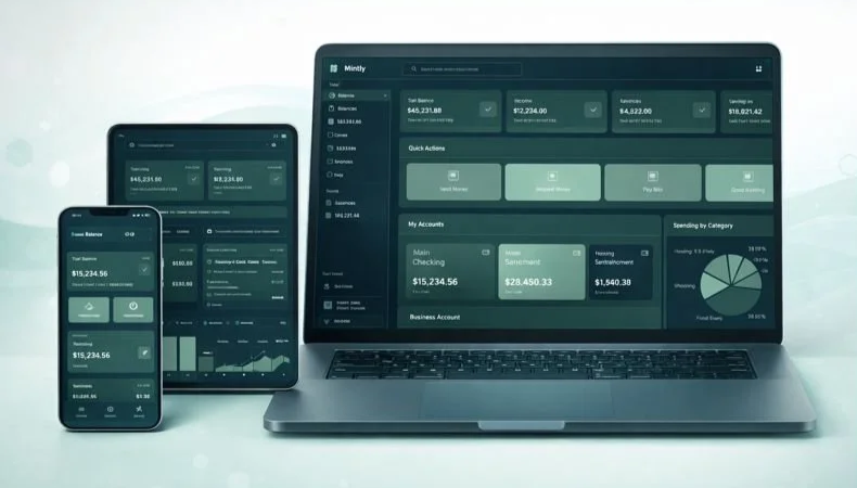
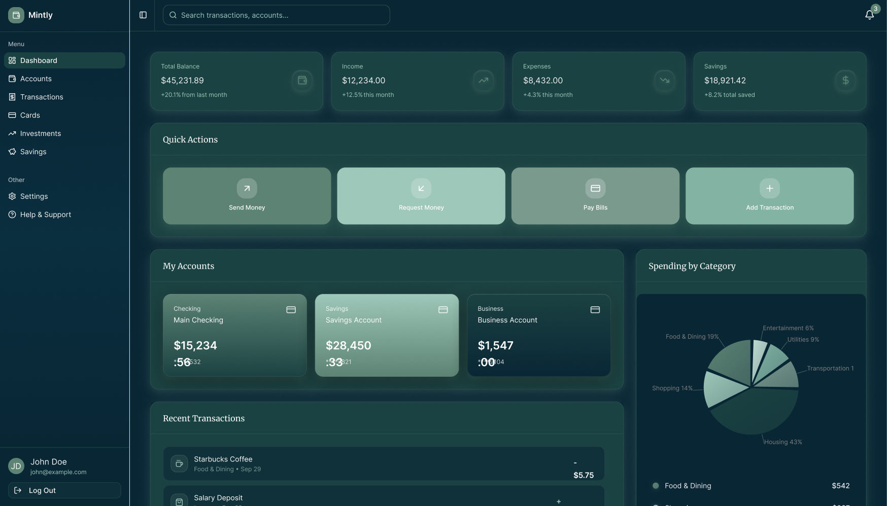
FINAL SCREENS
The designed experience.
Every screen went through 3 or more rounds of usability testing. Each design decision is backed by specific user evidence — not personal preference.
Designed to answer the user's most pressing question in under 3 seconds: "How am I doing financially?"
The layout follows a strict information hierarchy: total financial health summary at the top, quick actions in the centre, detailed account data below. Nothing competes for attention.
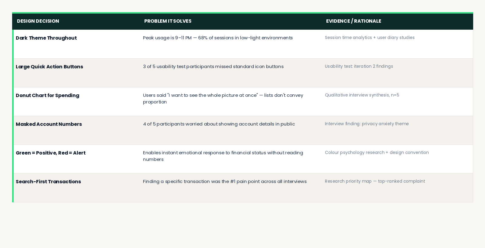
DESIGN DECISIONS
Every choice has evidence.
The table below documents the "why" behind every major visual and interaction design decision in Mintly. Good design can always be explained.
CHALLENGES & ITERATIONS
What we learned along the way.
CHALLENGE 1 - Information Overload on the Dashboard
Early dashboard prototypes tried to show everything simultaneously spending trends, recent transactions, all accounts, investment data, and savings goals on one screen. Usability testing revealed that users felt anxious, not empowered.
Users with complex finances (Marcus) found the density helpful. But Jordan the primary persona felt overwhelmed and disengaged before completing any task.
Solution: I introduced a progressive disclosure pattern. The dashboard shows high-level summary metrics first. Detailed views are always one tap away, never forced. The Spending by Category chart was moved to a side panel rather than the main content column, making it contextual rather than primary. Every addition to the dashboard during iteration made it worse removing features consistently increased satisfaction scores.
CHALLENGE 2 - Building Trust for Bank Connection
Early usability testing showed significant hesitation when users reached the bank account connection step. Despite clear copy about read-only access and encryption, users stalled. Trust signals were not visible enough at the critical moment of decision.
Solution: Added explicit security markers "256-bit encryption", "Read-only connection we can never move your money", "Powered by Plaid" with a Plaid logo — directly on the bank connection screen, not buried in a settings page. Post-change, onboarding completion rates in prototype testing increased substantially.
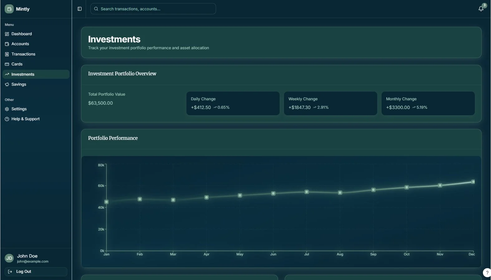
CHALLENGE 3 - Making Investments Approachable
The investments screen was initially data-dense: multiple chart types, percentage changes, ticker symbols, and a full asset allocation breakdown all visible simultaneously. Power users loved the depth. Casual users were immediately intimidated and disengaged.
Solution: Redesigned around a single primary chart (portfolio value over time) with three clear change metrics. All asset-level detail moved below the fold present for Marcus, invisible to Jordan unless she actively scrolls for it. The page now starts simple and rewards curiosity.
OUTCOMES & LEARNINGS
EARNINGS
Start with fewer features.
Every addition to the dashboard during the iteration phase made it worse. The most impactful design decisions were acts of removal, not addition. Constraints forced clarity.
Use personas as decision filters, not decoration.
"What would Jordan do?" became a reliable shortcut through every design debate. Personas are only useful if you reference them during the work, not just at the beginning.
Dark-theme-first forces better design discipline.
Working in a dark colour scheme required more rigorous attention to contrast, hierarchy, and typographic weight than a light theme would have. Every element earned its presence.
Trust is harder to build than usability is to fix.
Every interaction in a financial app is a trust signal. Copy, microcopy, security indicators, error messages — all of it either builds or erodes the user's confidence. Design the trust layer as intentionally as the visual layer.
WHAT'S NEXT
→ AI-powered financial insights: "You spent 34% more on dining this month — want to see where?"
→ Bill reminder and subscription tracker with automatic detection from transaction history
→ Mobile app expansion — apply the design system natively to iOS and Android
→ Multi-currency support for international users and expats
→ Collaborative accounts for couples and family financial planning
Design In Action
A quick walkthrough of key interactions and user flows.